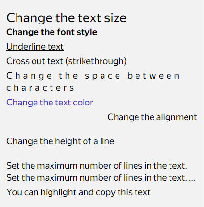
Text properties
List of properties
The text element uses the following properties to control text display:
font_size: Size.font_weight: Weight.font_variation_settings: Fine-grained control over variable font characteristics.text_color: Color. Priority: applied only if neitherrange.text_colornortext_gradientare set.text_gradient: Gradient text color. Priority: applied ifrange.text_coloris not set.letter_spacing: Spacing between letters. Can be positive (increases spacing) or negative (decreases spacing).line_height: Line height.max_lines: Maximum number of lines.text_alignment_vertical/text_alignment_horizontal: Alignment types.strike: Strikethrough.underline: Underline.
Color priority
When setting text color, the following priority is applied:
- Color in ranges (
range.text_color) has the highest priority - Text gradient (
text_gradient) is applied if no color is set for the range - Base text color (
text_color) is applied only if neither range color nor gradient is set
This allows you to override colors for specific parts of text while using gradient or base color for the rest.
View an interactive example
Text cropping
Any text that goes outside the limit on the number of lines is cropped.
max_lines: Maximum number of lines that won't be cropped when exceeding the limit.min_hidden_lines: Minimum number of cropped lines when exceeding the limit.ellipsis: Marker for cropping text when exceeding the limit.
By default, three dots are used, but the crop marker can be predefined via ellipsis.
Note
To create dynamic crop markers, you can use the range_builder and image_builder properties inside the ellipsis object. These properties work similarly to their counterparts at the top level of the text component and have priority over static ranges and images lists.
If the total number of text lines is less than or equal to the sum of max_lines + min_hidden_lines, the text isn't cropped. If the total number of text lines exceeds this sum, the text is cropped to max_lines lines.
Example. Suppose
max_lines = 3andmin_hidden_lines = 4. The total number of text lines is 7. The text won't be cropped.
Applying a property to a part of the text
To change the formatting of a part of a text, use the ranges and images properties or their dynamic counterparts range_builder and image_builder:
images: Replace the specified character with an image. For images, you can set vertical alignment using thealignment_verticalproperty (supported values:top,center,bottom,baseline).ranges: Range for applying the specified formatting. You need to specify the start (starting from 0) and the end of the range. Multiplerangescan overlap, and the specified properties will be applied to all the ranges. You can make a selected part of the text clickable using actions.range_builderandimage_builder: Dynamic builders that generate ranges and images from a data array. They have priority over staticrangesandimageslists. They work similarly to item_builder — usingdata,prototypes, andselectorto create elements.
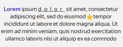
View an interactive example
For example, you can apply one formatting to the text and another one to the source name using the range property in the news text block.
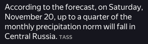
View an interactive example
Learn more
You can discuss topics of interest in the DivKit user community in Telegram: https://t.me/divkit_community_en.