Sets of states
The state element switches the appearance of content. You can use it to add:
- Buttons that change their state (for example, the like icon when tapped).
- Content that can be expanded (for example, a bridge card or a geo block).
One picture changes to another, but the user sees it as an interaction.
Initial and current state
Right after rendering, the state from the default_state_id property is active. If the property is not set, the first state from states is active.
The ID of the active state can be stored in a variable: specify its name in the state_id_variable property. When the variable value changes, the active state changes too. The variable takes priority over default_state_id.
Switching the state
To switch to a different state, use url:
div-action://set_state?state_id=<div_data_state_id/id/state_id>&temporary=<bool>
The path is formed from the hierarchy root:
|
Parameter |
Description |
|
|
The path of the state inside Can be hierarchical: |
|
|
Indicates a state change:
|
The same action in the typed form:
{
  "log_id": "show_clicked",
  "typed": {
    "type": "set_state",
    "state_id": "0/interactive_state/clicked",
    "temporary": false
  }
}
The temporary parameter of the typed action is supported on Android and iOS.
View an interactive example
Actions on div-state elements
The div-state element itself supports all standard action properties, allowing you to add interactive behavior directly to the state container:
actions: Actions triggered when clicking on the state elementlongtap_actions: Actions triggered when long-pressing the state elementdoubletap_actions: Actions triggered when double-clicking the state elementpress_start_actions/press_end_actions: Actions triggered at the start/end of a presshover_start_actions/hover_end_actions: Actions triggered when hovering over the element
Note
The press_start_actions and press_end_actions properties are especially useful for components with continuous interaction, such as sliders, where it's important to track the beginning and end of the drag gesture.
Example: div-state with actions
{
  "type": "state",
  "id": "interactive_state",
  "states": [
    {
      "state_id": "default",
      "div": {
        "type": "text",
        "text": "Click me to change state"
      }
    },
    {
      "state_id": "clicked",
      "div": {
        "type": "text",
        "text": "State changed!"
      }
    }
  ],
  "actions": [
    {
      "log_id": "state_click",
      "url": "div-action://set_state?state_id=0/interactive_state/clicked"
    }
  ],
  "longtap_actions": [
    {
      "log_id": "state_long_press",
      "url": "div-action://set_variable?name=long_pressed&value=true"
    }
  ]
}
This allows you to create more complex interactive behaviors where the state container itself responds to user interactions, in addition to the individual elements within each state.
Empty state
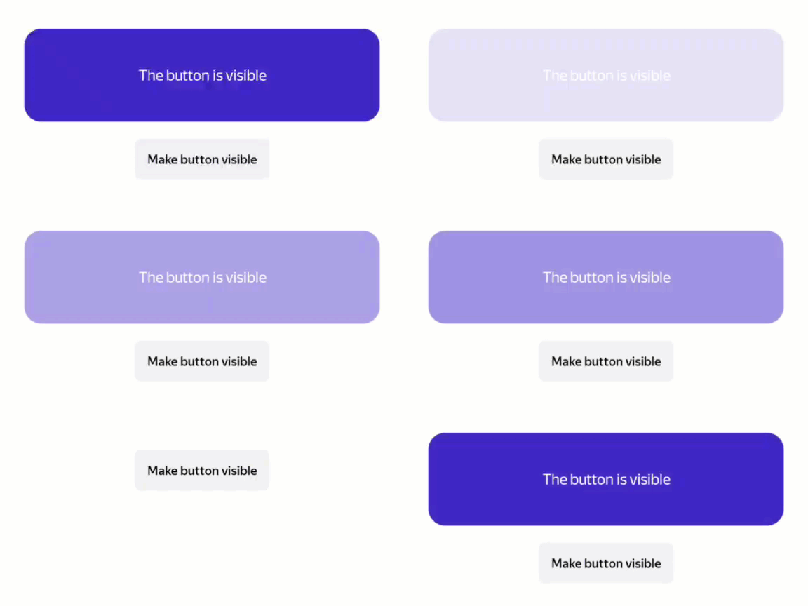
If you need to hide a block, don't add a div field, but specify "state_id": "empty".
View an interactive example
Nested states
If multiple states are nested in each other, write the full path from the root in order to switch:
div-action://set_state?state_id=[root state id]/[element's id]/[state's state_id]
View an interactive example
Learn more
You can discuss topics of interest in the DivKit user community in Telegram: https://t.me/divkit_community_en.