Element groups
Container
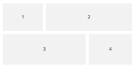
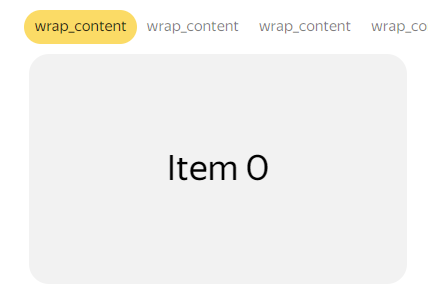
The most basic element that is responsible for the position of child elements is container. The elements in it are shown in the order they are specified.
In the orientation parameter, the following types of element orientations are specified:
-
vertical: For vertical orientation.View an interactive example
-
horizontal: For horizontal orientation.View an interactive example
-
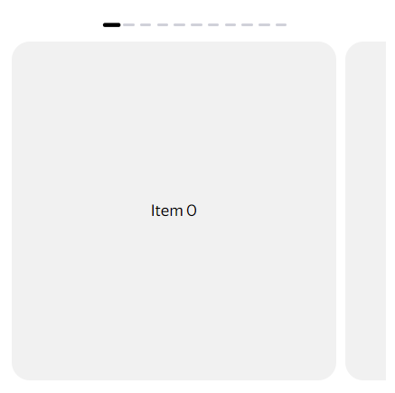
overlap: With overlap.View an interactive example
In order for the element to occupy all the free space, its width must be
match_parent. If there are several such elements, they will divide the space equally or distribute it according to the value of theweightparameter if specified.The smaller the number of the element in the
itemsarray atorientation:"overlap", the lower its position. The zero element of the container will be at the very bottom.
With the layout_mode parameter, you can control how elements are arranged. The wrap value indicates that the element wraps to the next line if it doesn't fit on the previous one. By default, layout_mode is set to no_wrap.
View an interactive example
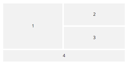
Grid
The grid element is used for the complex structure of the table layout. You can use it to position elements in multiple columns and rows.
You can merge cells in a row or a column:
row_span: Parameter for merging rows.column_span: Parameter for merging columns.
View an interactive example
The element weight (weight) determines how much space an element occupies inside the grid. It can be applied to both the width and height.
View an interactive example
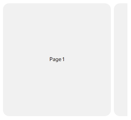
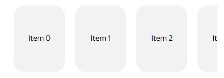
Pager
The pager element displays a horizontal set of cards, where the main card is fully visible, and the neighboring ones are partially shown.
View an interactive example
You can adjust the width of the main card in the layout_mode field:
- fixed: A fixed part of the adjacent cards is shown, and the remaining space is taken up by the main card.
- percentage: The width of the main card is indicated as a percentage of the width of the pager.
You can use the pager along with an indicator to display which card has been selected. The indicator can be positioned independently of the pager. The appearance of the indicator can be changed: you can adjust the distances between indicators, their shapes, colors, sizes, and switching animations.
View an interactive example
Gallery
Pictures inside the gallery element can be any size or content. They don't have to be the same type. The item_spacing parameter defines spacing between gallery elements except for the first and last margins: they can be managed using paddings.
The gallery height is set according to the height of the largest element.
View an interactive example
Tabs
The tabs element is different from the gallery because it has a header row. Only one page is visible at a time. You can switch to others by swiping.
The height of tabs is different on different platforms:
- On Android, the first tab is the original height. The height of the remaining tabs (from the second to the last) is the same and is equal to their maximum value.
- On iOS, all tabs are the original height.
View an interactive example
Separator
The separator element is used to divide space between elements.
The separator style is determined by the delimiter_style object:
{
  "type": "separator",
  "delimiter_style": {
    "color": "#000000",
    "orientation": "vertical"
  }
}
orientation: Separator orientation. It can be eitherverticalorhorizontal.color: Separator line color. To hide it, specify the transparent color#00000000.
The height of the separator line is independent form the height of the element itself and always equals 1 dp. Specifying a larger separator size will cause the separator to appear in the middle.
View an interactive example
Controlling tabs, pager, and gallery
To control these elements, use actions with element switching.
Learn more
You can discuss topics of interest in the DivKit user community in Telegram: https://t.me/divkit_community_en.