Element location and size
Size
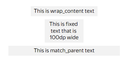
Size types
You can adjust the size of the elements in the card using the width and height parameters of the container element. They have one of the following size values:
- match_parent: The default width value, the element adjusts to the block containing it.
- wrap_content: The default height value, the element adjusts to its content.
- fixed: The fixed size value.
To make the element occupy half the height or be located at the bottom of the container, use match_parent. The algorithm distributes space in the following order:
- The space is occupied by elements with the
fixedandwrap_contentsize values. - The remaining space is divided by elements with the
match_parentsize value. By default, all elements with thematch_parentsize value divide the space equally or distribute it according to the value of theweightparameter, if specified.
Size constraints
Both match_parent and wrap_content size types support optional size constraints using min_size and max_size properties:
min_size: Sets the minimum size of an element. The element will never be smaller than this value.max_size: Sets the maximum size of an element. The element will never be larger than this value.
These constraints are useful for ensuring elements maintain reasonable sizes while still being responsive to their content or parent container.
Note
If a constraint is specified where min_size exceeds max_size, the system will log an error and ignore the invalid constraints.
Example: match_parent with size constraints
{
  "type": "container",
  "orientation": "vertical",
  "items": [
    {
      "type": "text",
      "text": "This text has constrained match_parent width",
      "width": {
        "type": "match_parent",
        "min_size": {
          "value": 100,
          "unit": "dp"
        },
        "max_size": {
          "value": 300,
          "unit": "dp"
        }
      }
    }
  ]
}
Example: wrap_content with size constraints
{
  "type": "text",
  "text": "This text has constrained wrap_content height",
  "height": {
    "type": "wrap_content",
    "min_size": {
      "value": 50,
      "unit": "dp"
    },
    "max_size": {
      "value": 200,
      "unit": "dp"
    }
  }
}
View an interactive example
Size measurement units
Note
The sp measurement unit is used only in Android.
If the fixed type is used, the result depends on the measurement units:
dp(density-independent pixels): A standard size measurement unit that is used by default and doesn't depend on the screen density.sp(scale-independent pixels): A measurement unit that depends on the text size factor on a phone.
If there is text in the element, specify the height in spto make the block scale together with the text. If the text doesn't fit, use dp.
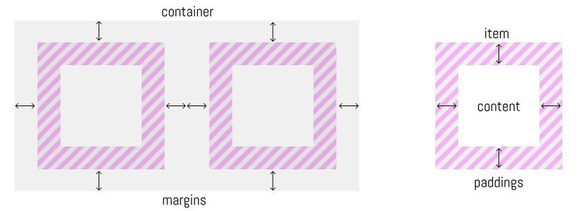
Element borders
To define the element borders, the paddings and margins parameters of the container element are used:
paddings: The distance from the card content to its borders.margins: The distance from the card borders to other elements and container borders. It doesn't affect the size of the card itself.
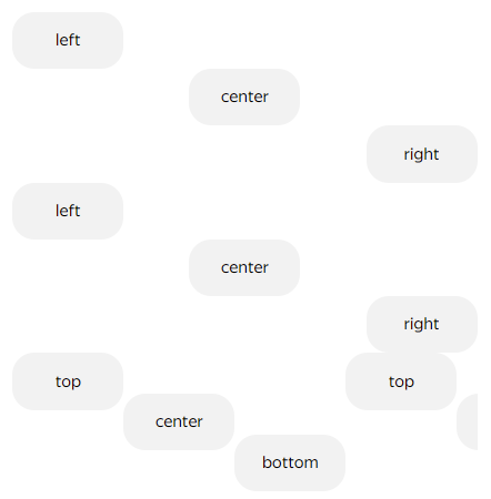
Alignment
The following parameters of the container element are used for horizontal and vertical alignment inside elements:
alignment_horizontal: Horizontal alignment. It can have theleft,center, andrightvalues. Inside a horizontally aligned container, you can only align vertically, meaning applycontent_alignment_verticalwith theleft(default),center, orrightvalues.alignment_vertical: Vertical alignment. It can have thetop,center, andbottomvalues. Inside a vertically aligned container, you can align horizontally, meaning applycontent_alignment_horizontalwith thetop(default),center, orbottomvalues.
If you specify the alignment inside a container, for example, content_alignment_horizontal, the child elements inherit this parameter. If the values are specified in the child elements, they will be overridden.
Scroll content alignment
The gallery element has a scroll_content_alignment property that controls how content aligns along the scroll axis:
start— to the startcenter— to the centerend— to the end
The default depends on the mode: start for galleries without paging scroll, center for galleries with paging scroll.
In a gallery with paging scroll, the property defines where items snap when paged. In a gallery without paging scroll, the property is used when scroll actions (for example, scroll_to) are invoked.
Example: gallery without paging, center-aligned on scroll_to
{
  "type": "gallery",
  "scroll_content_alignment": "center",
  "items": [
    {"type": "container", "width": {"type": "fixed", "value": 200}, "height": {"type": "fixed", "value": 100}, "background": [{"type": "solid", "color": "#FFCC00"}]},
    {"type": "container", "width": {"type": "fixed", "value": 200}, "height": {"type": "fixed", "value": 100}, "background": [{"type": "solid", "color": "#00CCFF"}]}
  ]
}
Element Spacing
To control the spacing between elements in a container, use the following properties:
item_spacing— spacing between elements in a container (in dp)line_spacing— spacing between lines in a container (in dp)
Usage notes:
- Both properties accept numeric values >= 0
- Default value:
0 - If the
separatorproperty is set,item_spacingis ignored - If the
line_separatorproperty is set,line_spacingis ignored - If there's a conflict between properties, a warning is generated through the DivKit error system
Note
The item_spacing and line_spacing properties provide the ability to control spacing between elements without using separators (separator and line_separator).
Example: using spacing properties
{
  "type": "container",
  "orientation": "vertical",
  "item_spacing": 10,
  "items": [
    {
      "type": "text",
      "text": "First element"
    },
    {
      "type": "text",
      "text": "Second element"
    },
    {
      "type": "text",
      "text": "Third element"
    }
  ]
}
View an interactive example
Getting Element Sizes with Layout Provider
Layout provider allows you to capture the actual rendered size of an element and store it in variables. This is particularly useful for creating responsive layouts where one element's dimensions need to depend on another element's actual size.
Warning
Using layout provider causes additional layout passes, which can significantly impact rendering performance. Use this feature only when necessary and avoid creating long chains of dependencies between elements.
How It Works
When you specify size values like wrap_content or match_parent, the final rendered size is calculated at runtime. Layout provider gives you access to these calculated dimensions by automatically updating specified variables with the element's width and height after layout.
The process works as follows:
- Declare variables to store the element's dimensions
- Add
layout_providerto the element with variable names - After the element is laid out, the variables are automatically updated with its actual size
- Use these variables in expressions for other elements' dimensions
Parameters
The layout_provider property accepts an object with two optional parameters:
width_variable_name: Name of the variable that will store the element's width (in dp)height_variable_name: Name of the variable that will store the element's height (in dp)
You can specify one or both parameters depending on your needs.
Size Calculation
The size stored in variables represents the element's content area:
- Includes: The element's width and height as rendered, including paddings and borders
- Excludes: Margins are not included in the calculated size
Tracking Element Count in Pager
The pager component supports the item_count_variable property, which allows tracking the number of visible elements. This feature is currently available only on the Web platform.
Parameters:
item_count_variable: Name of the variable that will store the number of visible elements in the pager
Behavior:
- The variable is automatically updated when the number of visible elements changes
- The value represents an integer (number of elements)
- Useful for creating count indicators or adaptive behavior based on element count
Warning
The item_count_variable property is currently supported only on the Web platform.
Responsive Layout Example
A common use case is creating elements whose size depends on other elements. In this example, we create three blocks where each subsequent block's dimensions depend on the previous ones:
View interactive example
Best Practices
- Initialize variables: Always declare variables with initial values (typically 0) before using them with layout_provider
- Avoid circular dependencies: Don't create situations where element A's size depends on element B, and element B's size depends on element A
- Use appropriate types: Declare variables as
integertype for dimension values
Learn more
You can discuss topics of interest in the DivKit user community in Telegram: https://t.me/divkit_community_en.