Interactive elements
Slider
The slider element is a scale that lets you select values within a certain range. The scale can have one or two indicators.
View an interactive example
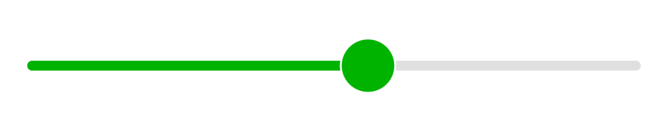
Scale
The scale style is configured in the thumb_style field.

View an interactive example
You can change the scale's track style in the following fields:
track_active_style: Sets the left-side track style for scales with one indicator, or the center-aligned track style for scales with two indicators.track_inactive_style: Sets the style for the rest of the scale.

View an interactive example
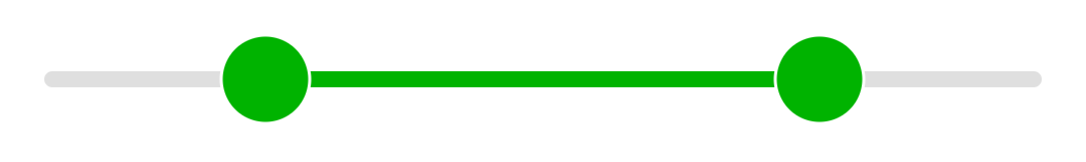
Indicator
You can add a second indicator using the thumb_secondary_style parameter.
View an interactive example
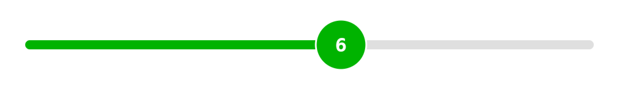
To display the currently selected value on the indicator, set the thumb_text_style field. You can set the text style for the second indicator in the thumb_secondary_text_style field.
View an interactive example
You can track changes in the value of indicators and perform actions when changes occur:
thumb_value_changed_actions: Actions triggered when the first indicator changes.thumb_value_secondary_changed_actions: Actions triggered when the second indicator changes.
The indicator values can be accessed via @{this.thumb_value} and @{this.thumb_secondary_value} in the action description.
In the following example, text transparency changes as the indicator moves:

View an interactive example
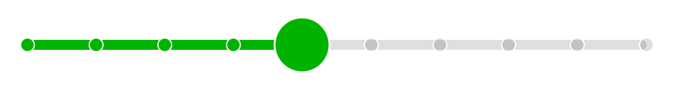
Ticks
You can add ticks to your slider scale:
tick_mark_active_style: Tick style for the selected range.tick_mark_inactive_style: Tick style outside the selected range.
View an interactive example
Learn more
You can discuss topics of interest in the DivKit user community in Telegram: https://t.me/divkit_community_en.